 Ashoka
HOME | LOGOTYPE | TYPOGRAPHY | COLOR | IMAGE GUIDE
Our Color

Primary Color
Ashoka Blue & Ashoka orange are essential for brand recognition, representing the core of Ashoka. Use this color asv the primary choice when creating products.

Secondary Color
Secondary colors serve to enhance and complement the primary colors. Among the secondary colors, Ashoka Orange takes precedence and should be prioritized over other colors in its usage and preference.

Tint & Shade Color
Supported colors and tint/shade colors are particularly advantageous for illustrations or backgrounds as they seamlessly harmonize with both primary and secondary colors to blend effortlessly.
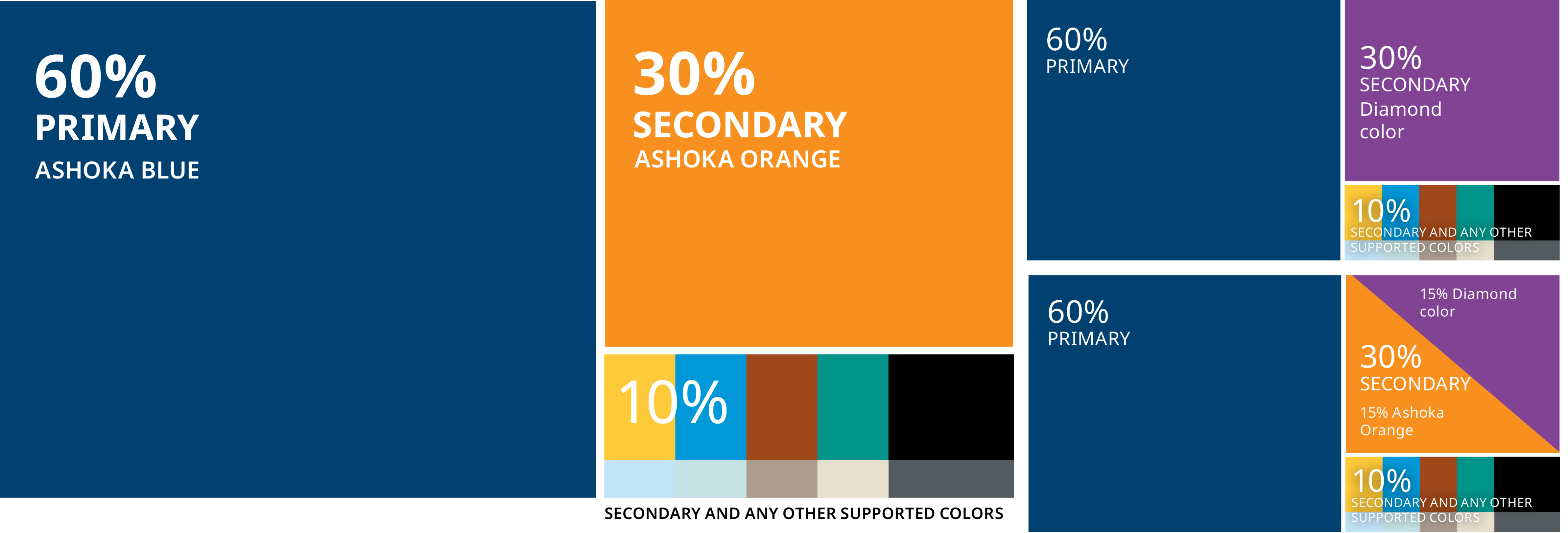
60-30-10 Rule
The 60–30–10 is a straightforward rule for creating well-balanced color palettes around any ASHOKA design. Allocate 60% of the design to Ashoka Blue, the primary color, 30 % for one secondary color, and under 10% for other secondaries and supported colors.
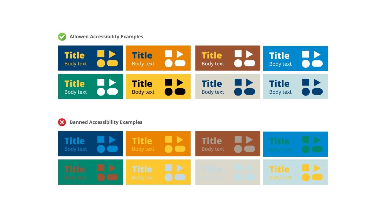
Color Accessibility
In alignment with our commitment to accessibility, all Ashoka microsites and websites aim to adhere to the WCAG 2.0 AA guidelines. This includes maintaining a minimum contrast ratio of 4.5:1 for text and images containing text, to ensure that all content is easily readable against its background. We rigorously avoid any design choices that do not meet this essential contrast criterion. For your convenience, we have listed color options that guarantee optimal contrast and visual clarity, specifically chosen to enhance content legibility against various backgrounds. These selected colors are intended for use across all elements, including body text and graphical components, to foster an inclusive and accessible digital environment.